Dave’s Diary - 38th Blog
Blind Create - illustration of a studio set up:
I’ve added a new acrylic painting to illustrate what a home studio set up could look like during Blind Create art tuition. The set up shows a laptop on the left facing an easel with a stretched canvas opposite so that I can see and guide a client with what is being painted.
There is a pallet with colour layer out and brushes ready to paint. The window with the landscape scene is there for a reminder of a landscape and to give the painting a kind of narrative.
The painting is here and is on A3 canvas unstretched If you like this painting and would like a copy please let me know and I can put a button on the Store of frame prints.
I’ve purposefully used striking colours in particular to highlight contrast in the compositive-
The background is purple and the use of orange and green are in various features in the subject as secondary colours.
Yellow, red and blue is also used to highlight specific areas of interest as primary colours.
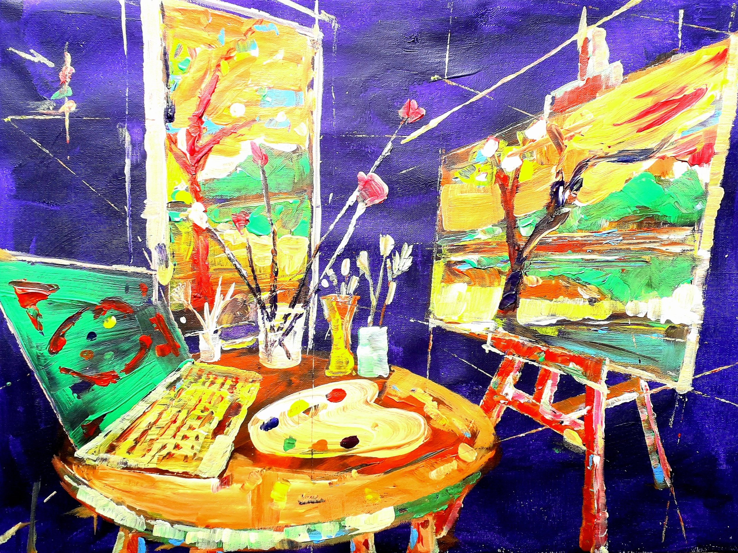
You may note the use of lines in the composition which interest and in some cases go through objects and beyond features such as the easel. These lines help with the construction and mechanics of the composition. They add to the movement in the artwork and how our ‘eye’ moves around the painting. The angles coincide with angles of the features on different sides of the painting and this helps the balance of the image.